Saturday, December 6, 2008

Finished posterizerationals


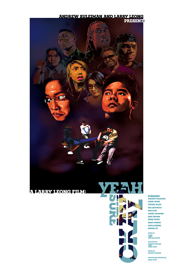
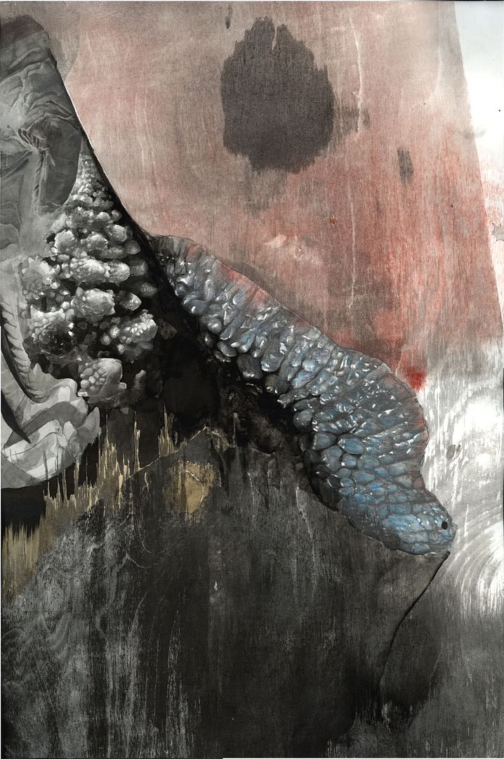
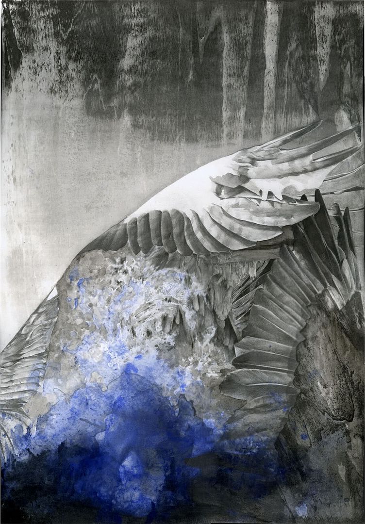
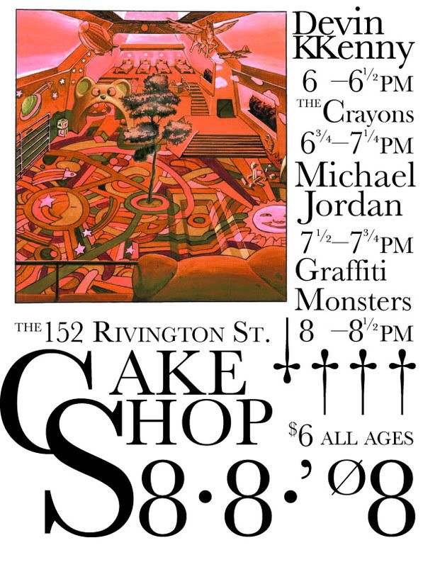
I finally finished the poster for yeah sure okay last night, because I got the kind of look I was trying for after a few drinks. The secret was in tiny highlights. It makes it look drawn instead of photographic while still edging on the side of representation rather than reinterpretation. I took more liberties with rendering the characters as well, something I was kind of unsure about at first because I've never met any of these people and I can only gather their likeness from blurry interlaced DVD captures. I figured after many drafts that making sure that everyone was happy with how they looked shouldn't be first priority.

The fluorescent lips were not intentional, it's just a combination of display settings on the macbook and illustrator shitting out random colors.

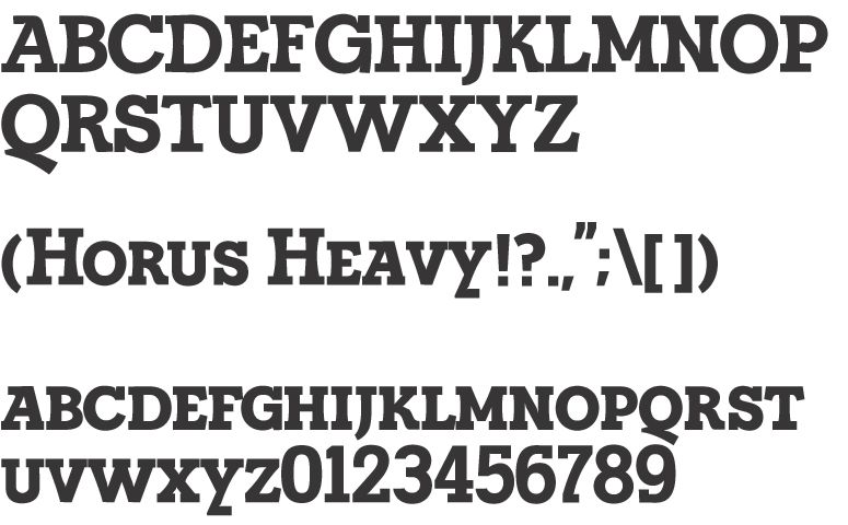
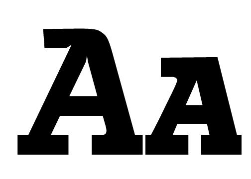
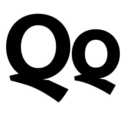
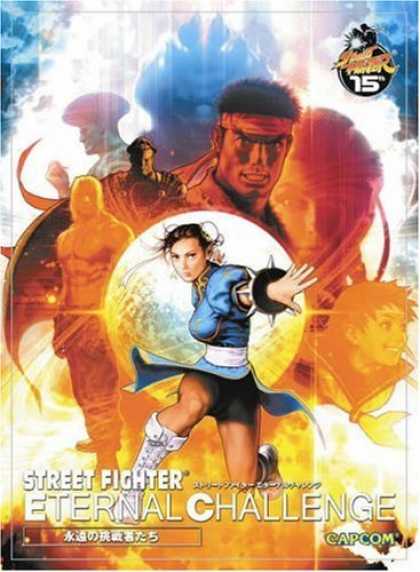
Poster layout was based on Street Fighter posters from back in the day, as well as the cover to the street fighter eternal challenge artbook. The font was once again horus heavy -- the font I made a while back which surprisingly looks decent at such small sizes. The poster feels better without the credits but that's kind of defeating the point of making a movie poster I suppose.

I might post more later but that's all I could scrape off the top of my head

Tuesday, November 4, 2008

A flyer I did yesterday for Devin Kenny and Daniel Oh's show on the 7th. Devin wanted elements that referenced current events. The economic meltdown and the election of 2008 are the big events I tried to incorporate both of them here, along with global warming and the decline of the American Empire. I tried to make the red stripes both the stripes of the flag, the declining line of a graph, and a tidal wave. With the names and times I tried to reference both a bar graph and skyscrapers. The blue was kind of a last-minute thing, because I wanted to get all the colors of the flag. It made this look too much like the comedy central logo, but I think it's a reasonable tradeoff.

Also, anyone know good uses for the envelope distort in illustrator? I had to use it alot in this and it was a gigantic pain in the ass.

Tuesday, October 21, 2008

MIIIIIIIDGET miiiiidget midget midget

This is a poster I made for the information design class of fall '07, that I re-did for the End of the Year show of summer '08. I'm only posting it just now because I couldn't get a hold of a certain font that I needed to show it properly (thanks Devin Kenny for being my accomplice in my font-robbing schemes).

Anyways, the assignment was to map a work of fiction, and I chose Trapped in the Closet. However, mapping it proved somewhat tricky because a normal character map in itself would already be thoroughly complex, nevermind a more, uh, philosophical approach. Simply mapping the interactions within Trapped in the Closet is completely uninteresting to me because it does nothing to show the absurd genius of the work. There's no way you can convey Trapped in the Closet better than it can convey itself, and this became the core problem for this project.

This is the same solution by Alex Kuo that I came across while teaching my summer class in California, 8 months after I made my poster. It's basically everything I didn't want to do in my project because it can only be a lesser imitation of the real thing, and I guess it's what hipster culture is all about. This is why Plato hates art.


This is my solution, which markets an as-of-yet fictional product based on Trapped in the Closet: the Trapped in the Closet Pinball Game. Instead of being a map of the actual movie/music video, its a map of R. Kelly's mind as he is making trapped in the closet, and it essentializes the rules within the storytelling rather than the actual story being told. Honestly, it's not the story itself that matters in Trapped, but rather the absurdity through which it is told. This project is both a representation and an extention of that. The abstract idea of physics relating to the broader idea of cause-and-effect is what gives rise to the mechanics of both Trapped in the closet as well as the pinball game.

Sunday, October 19, 2008

Digital painting explorations

So I've been working on a poster for Yeah Sure Okay, and I imagined a throwback to old illustrated movie posters from the 70s or 80s. Something like this:

I meant to do it on the computer so I could get good integration with typographic and vector elements in illustrator, and also because I don't have a scanner to conveniently put hand-drawn images into the computer. However, even with a tablet, painting on the computer is total bullshit.

Now, I thought this was because I was unfamiliar with the medium, and this is true. I went to the book store and then the comic book store to look at collections of digital paintings by professionals. They look like total ass too. Even with a tablet most painting techniques don't work, and it never gives the degree of control and subtlety that I imagined I'd have. On the plus side it's really easy to trace stuff, and that actually does save time

Moreover, the images I had to work with were awkwardly-lit DVD captures that were badly interlaced/compressed. So to start off I did a brute-force approach which didn't work great.
Then, I did a more comic-book approach by making the highlights sharper and reducing the number of colors. It worked fine and I'll probably use what I made. Both were from the same video frame and both of them get cut off at the waist. I didn't want such an arbitrary edge on the picture so I did some clever shit and tried to extend it.


Then I combined a sharp brush with opacity and size jitter with a large transparent airbrush in order to smooth out the inconsistent edges and contours in the previous renditions


However, it's a bit TOO perfect now, and it looks nothing like what I intended for it to look in the beginning.

In conclusion, Digital painting is really quick, somewhat convenient, completely unfulfilling, stupid, and unfortunately necessary. More updates later.

Graphic Design Update

I thought I'd do a massive update on the current project I'm doing when I'm done with it, but it's 5 am and I don't think I can sleep anytime soon so I'll do a quick update of what's going on so far. I set the "four updates a week" mandate so I'll spend time working, and it actually kinda worked since I have been keeping myself pretty busy. However, even though I have plenty of stuff to update the blog with I keep forgetting to actually get around to doing it.

Here's the latest draft of the business card that I did two weeks ago, with corrected contact info and a re-done image that does not make Larry look like a "down-syndrome ogre". I didn't bother designing the back because I was tired, but I might get around to it later. The black and white are just placeholder colors, meant to show contrast and transparency.


This is the logo for YSO. Originally I meant to make a normal version and a stencil version, but I ran into problems composing an interesting logo, which somehow resolved itself quite well when I made it into a stencil. So the stencil ended up being the regular logo.

I'll make another update later tonight about progress on the movie poster, which was much more troublesome than I expected.

Sunday, September 21, 2008

Cards are serious Business


As a continuation of last post, here's a rough sketch of a business card that I designed using the typeface I just made. I'll probably do different color combinations, which is why the hair is just pain gray right now (I plan to have a halftone but photoshop/illustrator combinations aren't going as well as I'd hoped, so I'll leave it gray til I figure out what to do.


I think it's kinda nice

Friday, September 19, 2008

Type protoTYPEs

I've been working on a typeface for a new project. I offered to design a bunch of stuff for a friend of mine's big new thing. This is a typeface that I'd probably use for the logo along with other materials. It's a display face that is more rounded than the kind of geometric slab serifs like Memphis but not as calligraphic as something like Century. All I have so far are the small caps, since those are what I'd be making the logo from.

I present: Horus Heavy
Of note are:

Slightly slanted As with a hat on top!
Descending calligraphic tails on the Qs (I didn't like the usual slab serif Qs, even if this does look a bit out of place)
And concave verticals, along with jutting serifs for the E, F, L, and T letters.

This was surprisingly quick to do. I started Saturday night and put less than 12 hours into this thing. I even got most of the kearning done. I need to go back and make another pass at it, but since it's a display font I'm not too worried about it looking perfect since I'll probably be adjusting the proportions in the logos anyways.

Cheers

Friday, August 15, 2008

Two of Three

So this is the last one I started for the series, this time using color with black and white throughout the entire process. I guess I don't particularly care for colors, and I had a lot of trouble integrating it into the composition in a way that didn't feel so heavy-handed. The part at the top is where the woodblock didn't manage to cover the entire paper, but I thought it was nice so I kept it. For the part where the woodgrain meets the drawn elements I wanted to make the depth ambiguous, but because I used the same ghetto registration technique it ended up being a bit off and now it just looks like something peeling up.

I like the first two much more than this one, because for this I felt a bit too desperate to add new elements that I really misused what I already had. It feels like a really stupid collage rather than the drawing I envisioned, so I took half a step forward and ten steps back, really.

Tuesday, August 12, 2008

One of Three


This is one of a series of drawings I did at the end of last semester. It's a combination of drawn elements as well as printed woodblock and monoprint. Originally I just started by "collaging" photographic elements by drawing them into configurations on the page, but that plays into my weaknesses and usually makes stale work. I'm rather controlling with mediums like drawing, to the level that I lose interest in the drawing itself because of its predictability.

Therefore I started adding monoprinted elements as well as starting the drawing in a different orientation than I intended to finish it, both as means of introducing unexpected results. For the wood grain I cut a mylar stencil to fit the drawing, stuck it to a plank of plywood using water, inked up the exposed wood with sumi ink, and ran it through the press. It's a terrible way of registering a print but I intended it to be that way so that there would always be a chance I'd destroy the drawing. I don't mean to reference the process of nearly destroying the drawing, it's just a way of separating myself from it. I then did a watercolor monoprint with the blue, but the introduction of color was rather unsuccessful, so I drew an image around it, making it into "waves". It's the first drawing I started for this set and the last one I finished, as I had to do alot of tweaking to blend the different elements together.

Oh yeah, the drawing was done using water-soluble graphite, so that I can run water over a portion drawn with pencil and it would completely erase the texture of the paper. It gives it a more organic look than pencil drawing but also gives a lot more control than watercolor washes.

Thursday, July 31, 2008

This is a poster I designed in collaboration with Devin Kenny for a gig he is performing on the 8th of August. Devin wanted something that would 1). advertise a show about gameboy music without relying on the usual symbols, and 2). Make his name really prominent. I make pretty terrible graphic design, most of the time, and I feel like this plays to my strengths. Grids are boring and so are most "mainstream" fonts, so I just dug up a rather plain, classical font (Baskerville) and tried to destroy both my grid and the letter forms. Overall it's a lazy effort that turned out much better than most of my serious efforts.

Oh, and the image is from Volume 2 of the Akira manga. It's the room where all the telekinetic subjects live. We touched it up a bit and changed the colors around. We chose it because it was nondescript but from a very awesome source.

Baldspot Waddle Manifesto

I'm starting this blog to make more work--as a diet that adds instead of subtracts--as the acceleration against my static friction. Four times a week, starting next week, I plan to update this blog with new work. All of this is fairly self-explanatory; and even though I'm doing the work "for myself" and "for art's sake", I'm sharing stuff on the internet for the first (maybe) time. And obviously I'm writing this blog post because I believe someone will read this blog and be impressed.

Even so, placebos are just as good as real medicine.


Edit: After a year and less than 2 dozen posts, I'm surprised I started so optimistically