The site is built around a late 19th-century orientalist-ish theme, which is a subject I'm pretty fascinated by because of its post-colonial implications, and also from how often I encounter "Empire of Signs" by Roland Barthes.
I wanted to reference engravings from that period and earlier, as it gives it a sense of place, but the trouble is rendering it so it looks like an engraving. I'm not confident enough in my penmanship to make the perfectly parallel curves that are necessary, like the ones here:

So I decided to use scratchboard, since it seemed similar to engraving. I hadn't touched scratchboard since high school, but one trick I learned from painting and drawing is that if you can't get the edge of the positive space perfect, then draw using the negative space. Kinda works in Photoshop too...
Scratchboard is ink that is applied in a relatively even layer over a piece of paper (or board) that has a coating to prevent the ink from soaking in. Just a bit of scratching and the ink scrapes right off. The problem is having the correct tool to do that. Just about any tool would make a scratch, but most of them don't do smooth and substantial lines.
The main issue is that if you scratch too hard and manage to damage the coating, the white fibers of the paper would soak up any ink or dirt residue nearby (which is very likely since you had to produce a lot of ink residue just scratching it to expose the fibers). Also, the ink isn't perfectly even throughout, and sometimes it sticks to the paper more than it should. It'll still scratch off, but the lines that run over that rough spot would look inconsistent.
With all these concerns, I bought myself a pair of scratchboard nibs for my pen. They don't work, don't ever buy them. They are designed to dig deep instead of scratching a wide path, so considering how fragile the coat is underneath you'd be better off using your fingernails.
So I assembled an array of improvised tools *cue A-Team music*
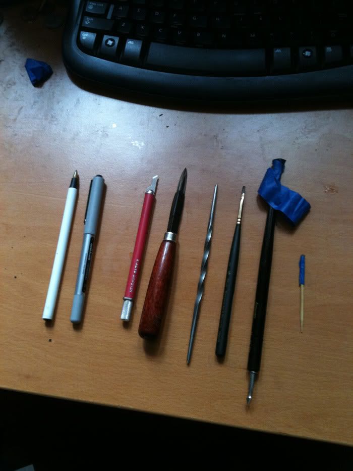
From left to right: ball-tip pen, regular ink pen, #16 x-acto blade, etching scraper, etching needle, brush, and two improvised wire scrubber pens.
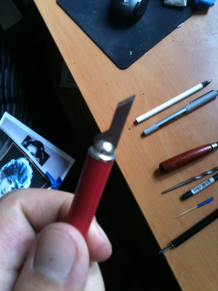
First, the #16 x-acto blade, which was the main tool used. I heard about its utility through google, and it is quite good. The regular x-acto blade has too sharp a tip, and the rounder blades don't give clean enough of a line. Also, you can feel the resistance from the surface of the scratchboard, which is necessary because you need to feel for an exact angle on both the X and Y-axes on the blade in order to get a good line.
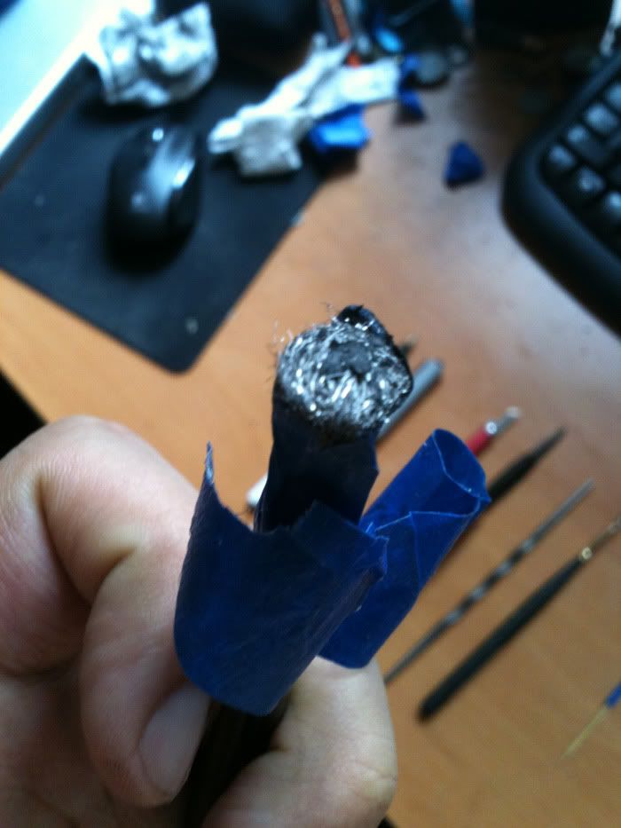
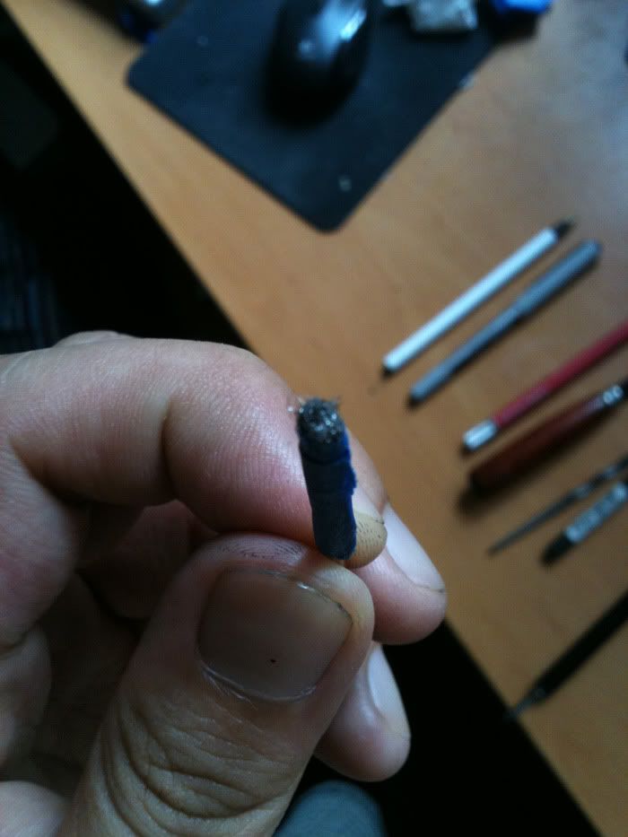
Then there are the two wire scrubber tools. It's impossible to get a patch of total white on a piece of scratchboard with a sharp scratch tool, because scratching creates enough of a groove in the paper that there will be spots that are impossible to scratch off (the knife will keep trying to follow the last groove that it made). The wire scrubber is good because it clears off a large flat section, leaving no dents on the paper, and will never damage the coating. I taped a piece to a pen and another to a toothpick.
 Then there's the work setup. I killed my back trying to draw on my desk, so I got one of those alvin drawing boards with adjustable legs and a ruler. One of the best purchases I've ever made, highly recommended.
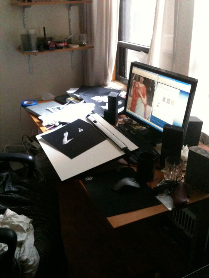 First I did some trials with technique, testing all the tools and whatnot. The drafts didn't turn out that well. Obviously I drew them freehand without any measurement or tracing, so the faces are warped to all hell, but the "look" wasn't there, they just looked like scratchboard drawings.
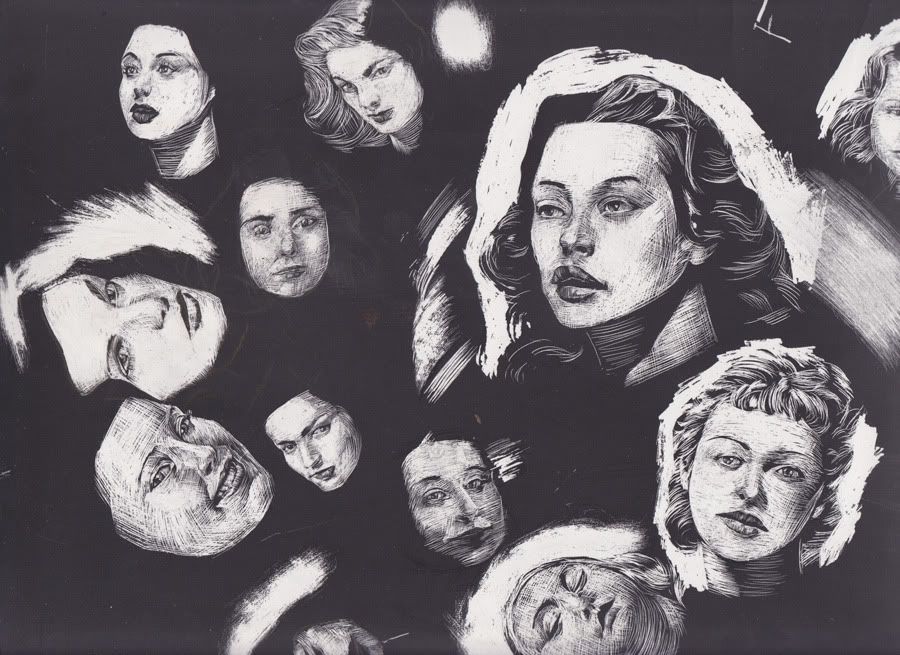 I tried different techniques and I eventually just relied on being able to disguise double-stroking on the whites, so I can methodically fill the lines in as opposed to getting them with a consistent motion. Here's a comparison:
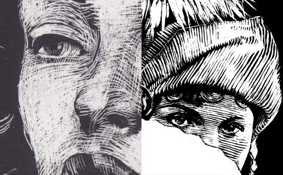
The final technique involved first composing the elements I wanted in photoshop, very roughly, and then printing them at the exact size.
 Then I tape it down with the scratchboard underneath and then trace everything with a ballpoint pen. The pen applies enough pressure through the paper that it leaves an impression on the scratchboard. It's much easier than using transfer paper and the blunt tip of the pen makes sure that you don't accidentally scratch while tracing
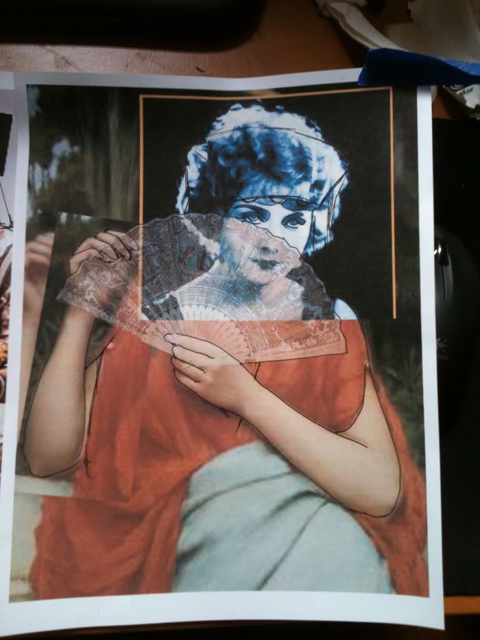
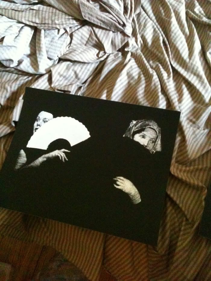
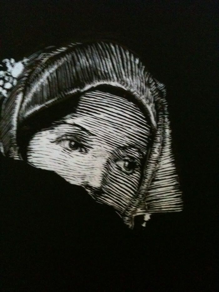
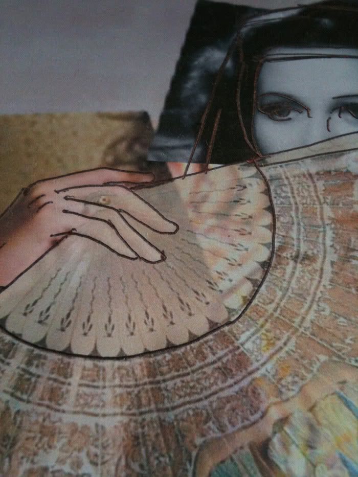 These are some versions that I didn't think were entirely appropriate. A couple of them had inconsistent line density which looked completely bizarre (not really that obvious in these pictures), and some of them didn't have enough visual interest.
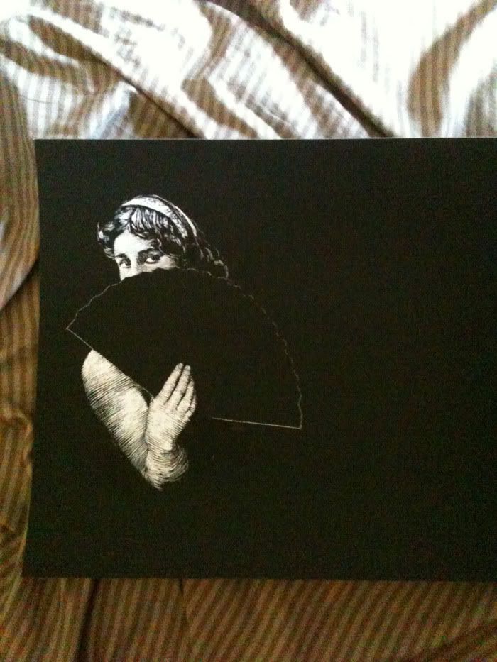
I'll link to the final images at my website, since this post is already filled with enough pictures. In the end I don't think I captured that theme very well, and wasn't willing to be as sarcastic as maybe the project needed. I don't know if I'll do more scratchboard in the future, since this was a very specific task, but I definitely learned a lot and it was fun to figure out