Tuesday, October 21, 2008

MIIIIIIIDGET miiiiidget midget midget

This is a poster I made for the information design class of fall '07, that I re-did for the End of the Year show of summer '08. I'm only posting it just now because I couldn't get a hold of a certain font that I needed to show it properly (thanks Devin Kenny for being my accomplice in my font-robbing schemes).

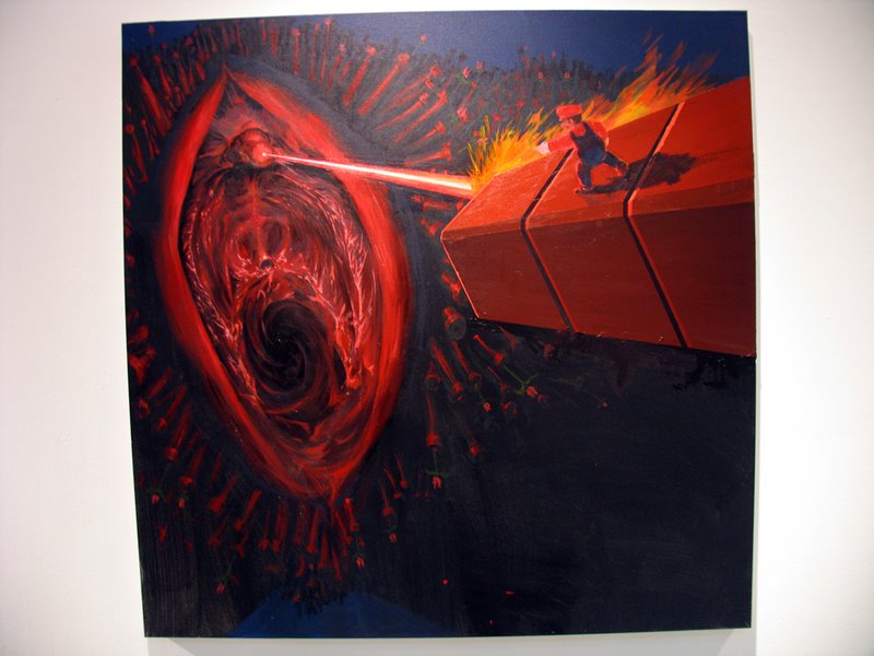
Anyways, the assignment was to map a work of fiction, and I chose Trapped in the Closet. However, mapping it proved somewhat tricky because a normal character map in itself would already be thoroughly complex, nevermind a more, uh, philosophical approach. Simply mapping the interactions within Trapped in the Closet is completely uninteresting to me because it does nothing to show the absurd genius of the work. There's no way you can convey Trapped in the Closet better than it can convey itself, and this became the core problem for this project.

This is the same solution by Alex Kuo that I came across while teaching my summer class in California, 8 months after I made my poster. It's basically everything I didn't want to do in my project because it can only be a lesser imitation of the real thing, and I guess it's what hipster culture is all about. This is why Plato hates art.


This is my solution, which markets an as-of-yet fictional product based on Trapped in the Closet: the Trapped in the Closet Pinball Game. Instead of being a map of the actual movie/music video, its a map of R. Kelly's mind as he is making trapped in the closet, and it essentializes the rules within the storytelling rather than the actual story being told. Honestly, it's not the story itself that matters in Trapped, but rather the absurdity through which it is told. This project is both a representation and an extention of that. The abstract idea of physics relating to the broader idea of cause-and-effect is what gives rise to the mechanics of both Trapped in the closet as well as the pinball game.

Sunday, October 19, 2008

Digital painting explorations

So I've been working on a poster for Yeah Sure Okay, and I imagined a throwback to old illustrated movie posters from the 70s or 80s. Something like this:

I meant to do it on the computer so I could get good integration with typographic and vector elements in illustrator, and also because I don't have a scanner to conveniently put hand-drawn images into the computer. However, even with a tablet, painting on the computer is total bullshit.

Now, I thought this was because I was unfamiliar with the medium, and this is true. I went to the book store and then the comic book store to look at collections of digital paintings by professionals. They look like total ass too. Even with a tablet most painting techniques don't work, and it never gives the degree of control and subtlety that I imagined I'd have. On the plus side it's really easy to trace stuff, and that actually does save time

Moreover, the images I had to work with were awkwardly-lit DVD captures that were badly interlaced/compressed. So to start off I did a brute-force approach which didn't work great.
Then, I did a more comic-book approach by making the highlights sharper and reducing the number of colors. It worked fine and I'll probably use what I made. Both were from the same video frame and both of them get cut off at the waist. I didn't want such an arbitrary edge on the picture so I did some clever shit and tried to extend it.


Then I combined a sharp brush with opacity and size jitter with a large transparent airbrush in order to smooth out the inconsistent edges and contours in the previous renditions


However, it's a bit TOO perfect now, and it looks nothing like what I intended for it to look in the beginning.

In conclusion, Digital painting is really quick, somewhat convenient, completely unfulfilling, stupid, and unfortunately necessary. More updates later.

Graphic Design Update

I thought I'd do a massive update on the current project I'm doing when I'm done with it, but it's 5 am and I don't think I can sleep anytime soon so I'll do a quick update of what's going on so far. I set the "four updates a week" mandate so I'll spend time working, and it actually kinda worked since I have been keeping myself pretty busy. However, even though I have plenty of stuff to update the blog with I keep forgetting to actually get around to doing it.

Here's the latest draft of the business card that I did two weeks ago, with corrected contact info and a re-done image that does not make Larry look like a "down-syndrome ogre". I didn't bother designing the back because I was tired, but I might get around to it later. The black and white are just placeholder colors, meant to show contrast and transparency.


This is the logo for YSO. Originally I meant to make a normal version and a stencil version, but I ran into problems composing an interesting logo, which somehow resolved itself quite well when I made it into a stencil. So the stencil ended up being the regular logo.

I'll make another update later tonight about progress on the movie poster, which was much more troublesome than I expected.