I've been working on a typeface for a new project. I offered to design a bunch of stuff for a friend of mine's
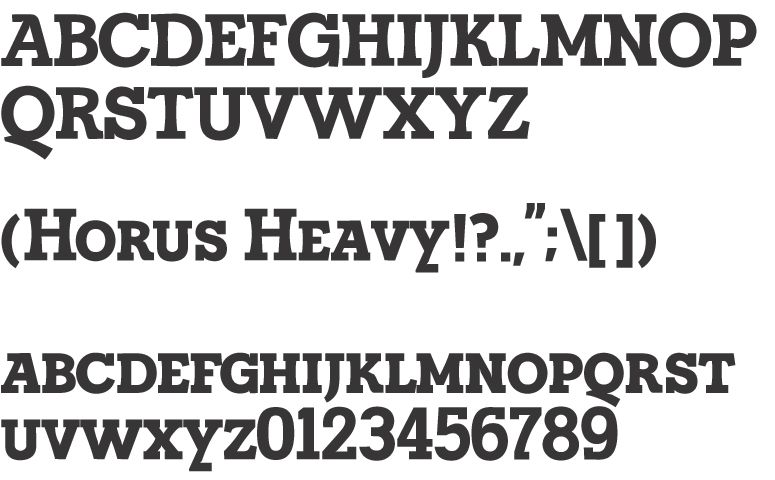
big new thing. This is a typeface that I'd probably use for the logo along with other materials. It's a display face that is more rounded than the kind of geometric slab serifs like Memphis but not as calligraphic as something like Century. All I have so far are the small caps, since those are what I'd be making the logo from.
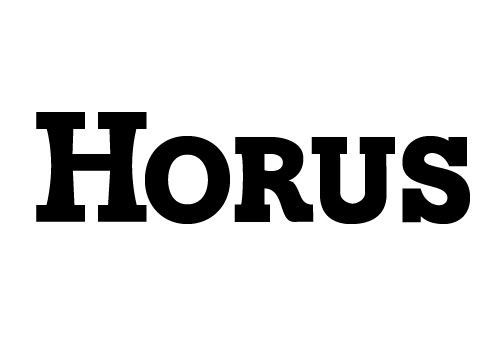
I present: Horus Heavy
Of note are:
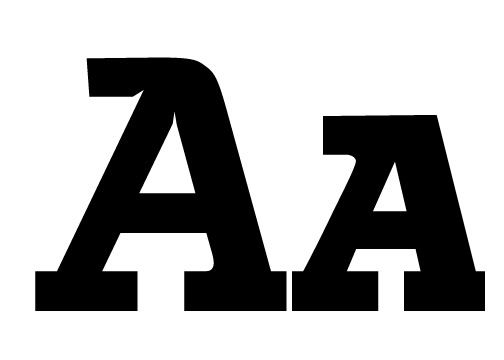
Slightly slanted As with a hat on top!
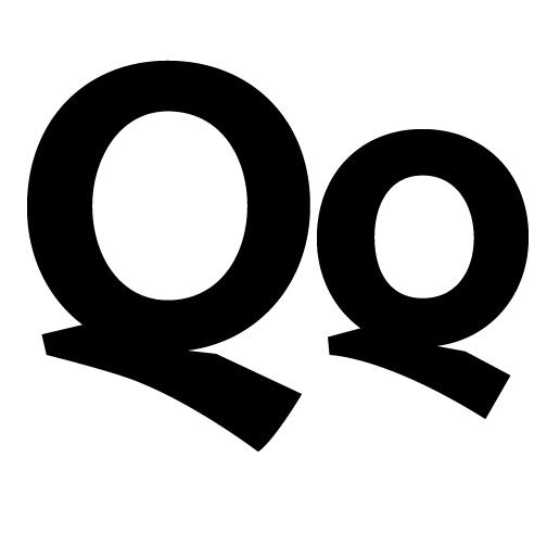
Descending calligraphic tails on the Qs (I didn't like the usual slab serif Qs, even if this does look a bit out of place)

And concave verticals, along with jutting serifs for the E, F, L, and T letters.
This was surprisingly quick to do. I started Saturday night and put less than 12 hours into this thing. I even got most of the kearning done. I need to go back and make another pass at it, but since it's a display font I'm not too worried about it looking perfect since I'll probably be adjusting the proportions in the logos anyways.
Cheers