First is a typeface that I started for the type design class a couple of years back (can't find the copy of it at the moment). It came from looking at black letter samples and how they were especially great for papercuts because of how well the letters interlaced with each other. I've seen stencil fonts but not papercut fonts, so this was an interesting jumping-off point for me. I didn't particularly like how the first one looked overwhelmingly digital, as because of time constraints in class I had no time to do proper sketches. I decided to redraw the font completely in my spare time, using the calligraphic pen as the model.
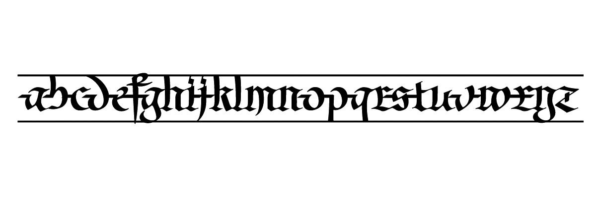 only lowercase characters at the moment, and I feel that it's a bit too constrasting and bold. I enjoy the variety of negative spaces but loathe the amount of kerning and ligatures I'd need to make this work. The space is actually a vertical bar that ensures the thing can stay connected without ascenders, descenders, and caps, but somehow neither photoshop nor illustrator renders it properly.
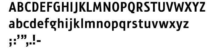
Second is a sans-serif I started because I had no experience making one (I don't particularly like using them). I tend not to like the lowercase g and capitals in sans-serif fonts, as the italic G is awkward to me. It wasn't made apparent to me how difficult a roman G is to fit with proper negative space into a sans-serif because of how simple the other characters were, so to avoid having a sideways pair of glasses or a circle with a fish hook I had to do alot of sketching to eventually settle on this version. It's kind of a hiccup in terms of legibility but I don't think this font is polished enough to be a text face anyways.
No comments:
Post a Comment