First was the logo, which was a disaster
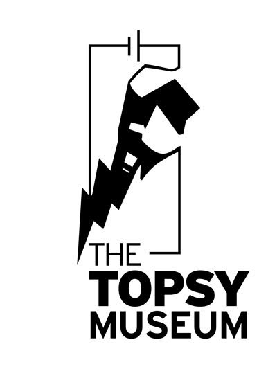 Apparently it doesn't look like an elephant but a fist with a lightning bolt. I was very sad because I couldn't see anything but an elephant. I eventually stuck to this one because I liked it way too much, and made some other versions just in case:
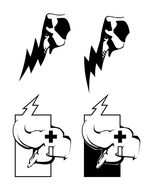
And the postcard:
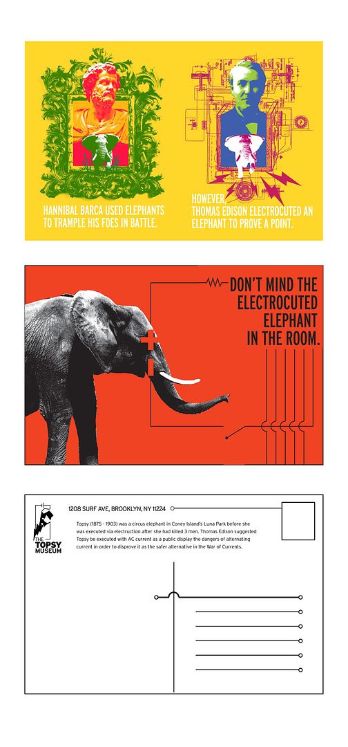 Two variations of the front and the same design for the back on both. Had to cut out the punchline for the first card ("Edison > Hannibal"), which is why it doesn't make a whole lot of sense in hindsight
1 comment:
Thank you.
(and orange is my fav. color)
J Gavin Heck
http://www.arssubterranea.org/media/nyt_topsy.htm
Termed a "hysterical, historical re-enactment," the float featured Mr. Heck positioned inside the elephant's head, while his 5-year-old son shook a pole bearing a mock lightning bolt. The float was judged Best Sea Creature. A subsequent float recreated a New Orleans-style setting for Topsy. The final part of the trilogy, which was seen last month at the most recent Mermaid Parade, depicted the resurrection of the elephant.
Post a Comment